
—– Overview —–
This week has still felt like not much of an improvement as I’m now hitting the mid section of this project. I feel like I’m on track for the project, however it is getting harder to truly look at the project and figure it out.
—– Wall adjusting and idea change —–
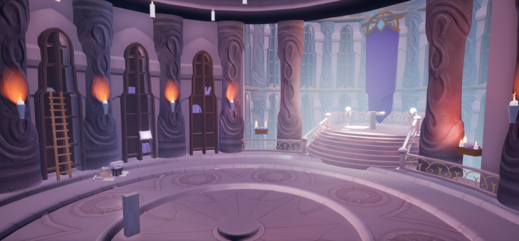
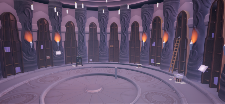
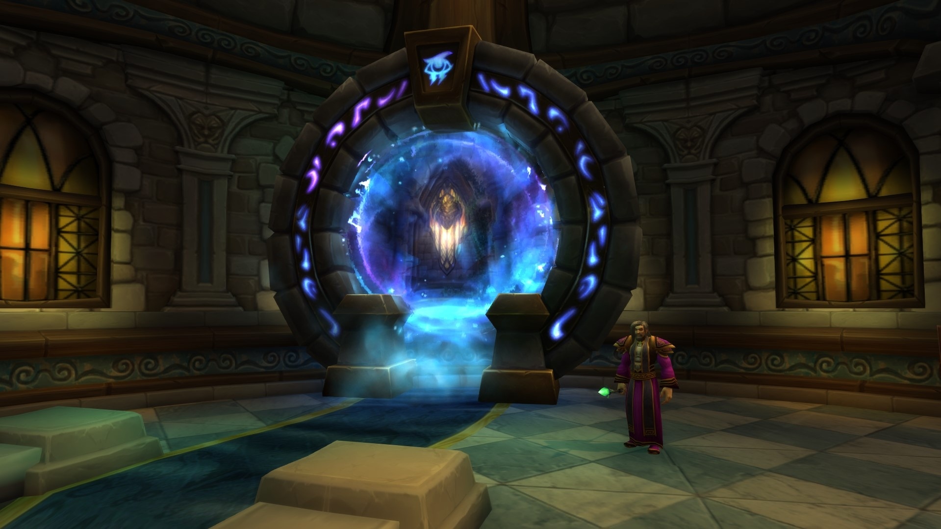
This week I’ve been focusing on some of the larger elements of the environment. The first major change involved closing off the large opening at the back of the room. With this change, the environment is now an enclosed environment instead of my original idea of a diorama. While I still love the idea of it being a diorama, I was struggling with balancing the lighting with having two large open windows of light, so the interior of the room was becoming darker and I couldn’t see the details very well. To fix that issue, I blocked off the room and I plan on designing a doorway to still make it look realistic, but keeping it either shut or finding a different creative way of creating a doorway, such as creating a portal doorway, similar to the portal into the Stormwind portal room within World of Warcraft (pictured below).
So the environment is branching off slightly from the in-game version of the environment, but I am trying to keep it similar enough to be believable that it’s still in the same world.
With this lighting change, the lighting coming from the tower seems to come through a lot nicer and flows a little more into the room still. To draw your attention to this area, which is the main vocal point of the environment, I made it a lot brighter there and also now updated the base model of the banner and fencing so the intricate detail of that area with drag your attention over. With the inclusion of the Kirin Tor logo and glowing effects around the banner, I hope this area will definitely be the vocal point.
—– Flooring —–
Another major change this week was my attempts on the flooring. This has been an on-and-off project for the past week which I have been struggling with a lot. I have done a few different tests to create the floor successfully, including making the floor into sections to have more UV space, or to bake various levels of detail onto a low poly (both sectioned and a full floor), but most have not seemed good yet. The current version is all the high poly details baked and the floor looks very flat and not too clear on the detail. However, having the detail on the floor makes the floor very high poly, and also makes the floor seem bumpy and wouldnt make sense for people to walk over.
I am still testing this as I go, but this baked version is my temporary solution so I can see how it would work. I also have the high poly in engine in-case I need to see how it could be seen with better quality detail.
—– Weekly Evaluation —–
Overall, I have made smaller changes, but they all change the environment for the better and have made major improvements to the project. I made all the changes and fixes I mentioned last week, and would like to continue improving the meshes and maybe even start adding some more VFX.
- Create idea for new doorway fix
- Figure out final plan for floor
- Come up with ideas for custom floor tiles
- Banner into marvellous designer
After seeing the progress I’ve made from last week to this week, and every week in general, I’ve been impressed with what I’ve created and hope I can keep up the pace and bring it to life. I have two more weeks before the mid-project meeting I believe, and feel confident to show my idea and my plans for the future.
Until next time!
